Building Effective MPU Adverts
Making the most of new ad positions on the StudyLink sites
StudyLink.com recently added support for MPU (Mid Page Unit) web banners to promote your courses to prospective students. With StudyLink.co.uk soon to support this banner size, we decided to look at what makes an effective MPU banner so your institute can make the most of every impression your advert receives.

The MPU Banner
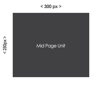
One of the IAB’s standardized range of web banners, the MPU consists of a rectangle 300 pixels in width by 250 pixels in height. The common placement of the MPU banner is to the right of page content, often above the fold in a right aligned column.
The dimensions of the MPU give a much squarer space to design for in comparison to the standard Skyscraper banners slender profile (120 pixels in width by 600 pixels in height).
Keep Your Message Consistent
As is the case with all web banners, the MPU has it’s own particular quirks that make designing an effective banner a considered task. You require space for a strong CTA and headline/banner text, also a suitable image to accompany the message of the CTA and headline. Finally, you need to place your institutions logo in a manner that conforms to your brand guidelines.
With all these elements competing for attention in a box-like shape, the challenge is to use the available space to create a clear message to the ads recipient.
With this in mind, a good starting point is to consider the landing page that your MPU will send your visitors to. This page should be reflected in your banner design, so the user is delivered a consistent experience from advert to landing page. Use the landing page to dictate the image and headline that you select. The CTA should reflect the purpose of the landing page, so if you expect users to sign up from your landing page, mention this in your CTA text.
A Small Word of Warning
When putting together your MPU banner do not be tempted to put too much information into the space available. Sufficiently small text risks going unread – especially on smaller displays. Try to be sparing with the information you include to make the MPU an effective teaser for your landing page.